


Tips for Choosing Color Temperature
The Science and Art of Color Temperature: A Comprehensive Guide to Illuminating Your World
The light that fills our spaces does far more than simply banish darkness; it fundamentally shapes our perception, influences our mood, regulates our biology, and defines the functionality of our environments. At the heart of this transformative power lies a crucial, yet often overlooked, characteristic: Color Temperature, measured in Kelvin (K). While the initial tips provide a solid foundation, truly mastering the use of color temperature requires a deeper dive into its science, its profound impact on human physiology and psychology, and its nuanced application across diverse settings. This comprehensive guide expands significantly on those core concepts, empowering you to make truly informed lighting decisions for any space or activity.
Part 1: Demystifying the Kelvin Scale - Beyond the Numbers
The Kelvin scale, named after the physicist Lord Kelvin, originates from the concept of heating a theoretical "black body radiator." As this object heats up, it glows, emitting light whose color shifts predictably:
Low Temperatures (e.g., 1000K): A dim, deep red glow, akin to embers.
Moderate Temperatures (e.g., 2000K-3500K): Progressing through orange and yellow to a warm yellowish-white. Think candlelight (1800K-2000K) or traditional incandescent bulbs (2700K-3000K).
Higher Temperatures (e.g., 4000K-6500K): Moving into neutral white, then cool white, and finally a bluish-white. This mimics the progression from dawn light to midday sun under a clear sky.
Crucially, the light source itself doesn't need to be hot to emit light at a specific Kelvin rating. Modern LEDs achieve desired color temperatures through phosphor coatings or combinations of different colored diodes, without generating significant heat relative to their output.
The Psychological and Physiological Spectrum:
Our perception of color temperature isn't just aesthetic; it's deeply wired into our biology:
Blue Light (Higher Kelvin, 5000K+): This portion of the spectrum is most effective at suppressing melatonin production, the hormone responsible for sleepiness. Exposure to high-Kelvin light during the day boosts alertness, cognitive function, reaction times, and mood. This is why cool white light is often chosen for offices, hospitals, and factories – it promotes wakefulness and focus. However, this same stimulating effect becomes problematic in the evening. Exposure to blue-rich light after sunset can significantly disrupt circadian rhythms, delaying sleep onset and reducing sleep quality. Studies have linked excessive evening blue light exposure to increased risks of sleep disorders, obesity, and even certain types of cancer.
Red/Amber Light (Lower Kelvin, <2700K): This end of the spectrum has minimal impact on melatonin suppression. Warm light promotes relaxation, reduces physiological arousal, and creates a sense of intimacy, comfort, and safety – feelings evolutionarily associated with firelight and sunset. This makes it ideal for winding down in the evening in living rooms, bedrooms, and dining areas.
Neutral White (3500K-4500K): Occupies a middle ground. It provides good visual clarity without the intense stimulation of cool white or the pronounced relaxation effect of warm white. It’s less likely to cause significant circadian disruption in the evenings than cool white but is still generally avoided in bedrooms close to bedtime.
Part 2: Deep Dive into Color Temperature Ranges - Nuances and Applications
Ultra Warm White (<2700K - 1800K): The Sanctuary Light
Bedrooms (Evening/Night Lighting): Primary ambient light for pre-sleep routines and nightlights. Use dimmable fixtures for maximum control.
Meditation/Yoga Rooms: Creates a serene, grounding atmosphere.
High-End Restaurants (Intimate Seating Areas): Enhances exclusivity and relaxation.
Outdoor Pathways/Patios (Low-Level): Provides gentle, welcoming guidance without harsh glare or light pollution.
Decorative Accents: Lamps, sconces, or string lights where ambiance is paramount over task performance.
Characteristics: Deep amber to rich golden hues. Very low blue light content.
Mood & Atmosphere: Profoundly calming, intimate, cozy, nostalgic, meditative. Evokes candlelight, firelight, or deep dusk.
Physiological Impact: Minimal melatonin suppression. Strongly promotes relaxation and signals the brain it's time for rest.
Ideal Applications:
Caveats: Not suitable for tasks requiring visual acuity (reading fine print, intricate crafts) or spaces where alertness is needed. Can feel overly dim or "dingy" if used as the sole light source in large spaces.
Warm White (2700K-3000K): The Comfort Zone
Bedrooms (General Ambient Lighting): Creates the foundational cozy atmosphere.
Living Rooms/Family Rooms: Fosters conversation, relaxation, and TV viewing comfort.
Dining Rooms: Makes food look appealing (warms up reds, yellows, browns) and creates a convivial atmosphere.
Hotel Lobbies/Guest Rooms: Enhances feelings of hospitality and comfort.
Boutiques (Fashion, Home Decor): Can make spaces feel luxurious and inviting, especially for warm-toned merchandise.
Outdoor Entertaining Areas: Creates a welcoming extension of indoor living spaces.
Characteristics: Yellowish-white, soft and inviting. The quintessential "incandescent" feel.
Mood & Atmosphere: Warm, welcoming, relaxing, comfortable, traditional, secure.
Physiological Impact: Low to moderate blue light content. Promotes relaxation but is less intensely soporific than Ultra Warm. Still disruptive to sleep if used brightly close to bedtime.
Ideal Applications:
Caveats: Can make blues and greens appear slightly dull. May not provide sufficient "crispness" for detailed tasks in isolation.
Natural White / Neutral White (3500K-4500K): The Balanced Performer
Kitchens: Provides excellent clarity for food prep, cooking, and cleaning. Reveals food colors accurately.
Bathrooms: Ideal for grooming tasks (shaving, skincare), seeing true colors, and maintaining a clean appearance.
Home Offices/Studies: Supports concentration and reduces eye strain during work hours.
Garages/Workshops: Good visibility for mechanical tasks and projects.
Retail Stores (General): Shows merchandise colors accurately and creates an energetic, clean atmosphere.
Classrooms: Balances alertness with a comfortable learning environment.
Living Rooms (Task Lighting/Modern Aesthetics): Can be used in reading nooks or in contemporary spaces seeking a cleaner look.
Characteristics: Clean, clear white light. Minimizes color cast – objects appear closer to their "true" color under daylight. *Note: The range 4000K-4500K is often specifically termed "Neutral White," while 3500K-4000K can be a transition zone.*
Mood & Atmosphere: Balanced, clean, natural, efficient, professional, alert but not harsh.
Physiological Impact: Moderate blue light content. Supports alertness and focus during daytime hours without being overly stimulating like higher Kelvin light. Its impact on circadian rhythm is significant in the evening, so transition to warmer tones is recommended.
Ideal Applications:
Caveats: Can feel slightly "clinical" or cold compared to warm white in purely residential relaxing spaces if overused. Not ideal for creating a cozy evening atmosphere in living or sleeping areas.
Cool White / Daylight White (5000K-6500K+): The Energizer
Commercial Offices: Enhances productivity, focus, and visual acuity for detailed tasks.
Hospitals/Clinics (Exam Rooms, Surgery): Provides maximum visibility for critical tasks and can promote staff alertness.
Industrial Settings (Factories, Warehouses): Essential for safety and precision in complex or hazardous tasks.
Art Studios/Galleries (True Color Evaluation): Provides high-CRI light essential for accurate color matching and critical viewing (often paired with 5000K standards).
Jewelry Stores: Makes diamonds and metals sparkle brilliantly.
Retail (Electronics, Automotive): Creates a bright, modern, high-tech feel.
Task Lighting (Specific Home Applications): Over kitchen sinks, detailed craft areas, workshops during daytime hours, or in the garage for intricate work.
Security Lighting: Deters intruders and enhances camera visibility.
Characteristics: Crisp, bright white with noticeable blue undertones. Mimics a bright midday sun under a clear sky (though actual daylight can vary significantly).
Mood & Atmosphere: Energetic, alert, stark, modern, clinical, sterile, invigorating, spacious (can make walls appear to recede).
Physiological Impact: High blue light content. Maximally suppresses melatonin, significantly boosting alertness, concentration, and reaction time during the day. Highly disruptive to circadian rhythms in the evening and night.
Ideal Applications:
Caveats: Can feel harsh, cold, and uninviting in residential living or relaxing spaces. Can cause glare and eye strain over prolonged periods, especially if fixtures are poorly shielded. Strongly discouraged in bedrooms and generally avoided in living/dining areas for evening use. Can make skin tones look pale or washed out.
Part 3: Advanced Spatial Application - Tailoring Light with Precision
Building on the core room recommendations, let's explore the nuances and advanced considerations for each space:
Living Room (The Multi-Functional Hub):
Ambient: 2700K-3500K for overall warmth and coziness. Dimmable essential.
Task (Reading Nook): 3500K-4000K for reduced eye strain.
Accent (Artwork, Plants): Use warmer (2700K-3000K) or cooler (4000K) light deliberately to enhance or contrast with the object. Color temperature adjustable spotlights offer ultimate flexibility.
TV Viewing: Very low-level ambient light (2700K-2200K, dimmed below 10-20%) is best to reduce eye strain without causing screen glare.
Primary Recommendation (3500K-4000K): Provides a good balance. Clean enough for reading or hobbies, yet warm enough for relaxing in the evening.
Layered Approach is Key:
Consider Style & Time of Day: Modern minimalist spaces might lean towards 3500K-4000K ambient. Traditional spaces favor 2700K-3000K. Implementing tunable white systems allows shifting from 4000K during the day for activities to 2700K in the evening for relaxation.
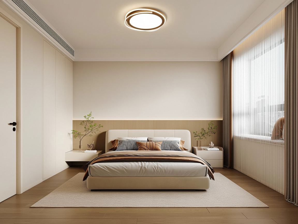
Bedroom (The Sanctuary for Sleep):
Non-Negotiable Ambient: 2700K-3000K (dimmable!). This is fundamental for signaling wind-down time and supporting melatonin production.
Vanity/Grooming Area: A separate, well-placed task light at 4000K-5000K is crucial for accurate makeup application or shaving. Ensure it's switched independently from the warm ambient lights.
Reading in Bed: Use focused task lamps (bedside) at 3500K-4000K. Avoid cool white. Dimmability is vital.
Children's Rooms: Follow the same warm ambient principles. Consider fun, ultra-warm nightlights (<2200K). For homework desks, provide a separate 4000K task light.
Circadian Lighting Systems: Advanced systems gradually shift color temperature and intensity throughout the day, mimicking the natural progression of sunlight (cooler/morning, neutral/midday, warm/evening, ultra-warm/night).
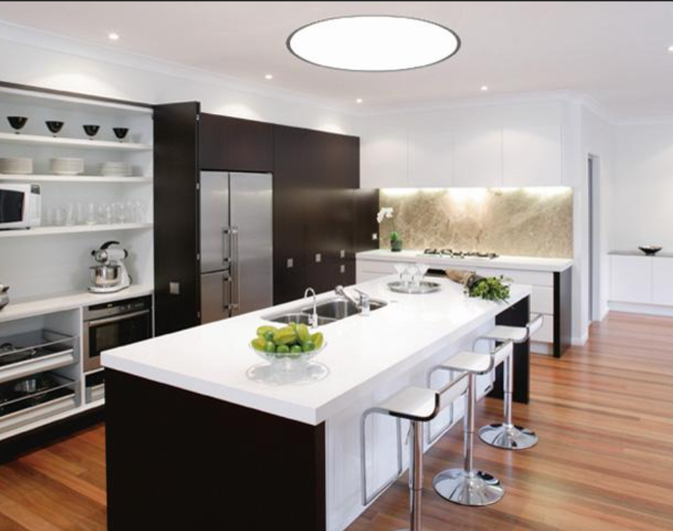
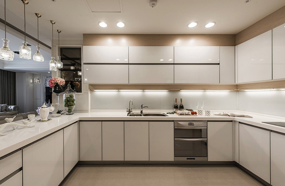
Kitchen (The Functional Heart):
General Ambient: 3500K-4000K provides a clean, bright foundation without feeling clinical.
Critical Task Lighting: Under-cabinet lighting is paramount. Use 4000K-5000K high-CRI (90+) LEDs directly over countertops, sinks, and stovetops for optimal visibility and color accuracy (judging meat doneness, herb freshness). Ensure even coverage without shadows.
Island/Pendant Lighting: Can match ambient (3500K-4000K) or provide task-level light (4000K). Dimmable options are valuable for transitioning from cooking tasks to casual dining/entertaining.
Pantry/Storage: 3500K-4000K for good visibility.
Consider Reflectance: Glossy surfaces and stainless steel benefit from higher Kelvin (4000K-5000K) for maximum sparkle and cleanliness perception.
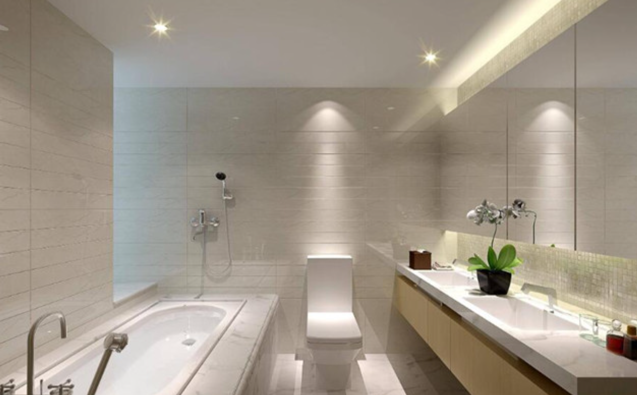
Bathroom (Grooming & Relaxation):
Vanity/Mirror Lighting (Most Critical): 5000K-6000K with CRI >90 is ideal for true color rendering during shaving, skincare, and makeup application. Lights should flank the mirror at eye level to eliminate shadows on the face. Overhead lighting alone creates unflattering shadows. Dimmability allows lowering intensity for nighttime visits.
General Ambient: Can be slightly warmer (3500K-4000K) to balance the cool task light and create a less clinical overall feel, especially in larger bathrooms or master suites. Ensure it doesn't conflict with the vanity light's purpose.
Shower/Tub Area: Use warm white (2700K-3000K) for a relaxing, spa-like atmosphere. Ensure fixtures are rated for wet/damp locations.
Nightlights: Ultra-warm white (<2200K) at floor level provides safe navigation without disrupting sleep.
Home Office/Study (Focus Zone):
Primary Recommendation: 4000K-5000K ambient light supports sustained concentration and alertness during working hours.
Task Lighting: Essential! A dedicated desk lamp (adjustable arm) at 4000K-5000K provides direct, shadow-free light on the work surface, reducing eye strain. Position it opposite your writing hand to avoid shadows.
Glare Control: Position monitors perpendicular to windows. Use blinds/curtains. Ensure overhead lights don't reflect on screens (baffled fixtures help). Bias lighting (warm white LED strip behind the monitor) can reduce perceived screen glare and eye fatigue.
After-Hours Consideration: If used in the evening, dimming ambient lights and relying more on a warmer task lamp (3500K-4000K) can help mitigate circadian disruption. Tunable white fixtures are ideal here.
Dining Room (Atmosphere Creator):
Ambient Recommendation: 2700K-3000K (dimmable!). This universally enhances food appearance (especially warm-toned foods), flatters skin tones, and creates intimacy.
Pendant/Chandelier Focus: The fixture over the table should be the primary light source, providing focused illumination on the table surface. Dimmers allow adjusting brightness from bright for family meals to low for formal dinners.
Accent Lighting: Use warmer tones (2700K-2200K) in sconces, buffet lamps, or uplights to wash walls, highlight art, or create depth. Avoid cool tones.
Buffet/Serving Areas: Small task lights (3000K-3500K) under cabinets or in display shelves can be practical.
Part 4: Mastering Special Scenarios - Beyond the Basics
Makeup Application (The Daylight Standard):
Why 5000K-6000K? This range most closely replicates the color balance of average midday daylight (D50 or D65 standard illuminants in color industries), providing the most accurate representation of how makeup will look outdoors or in office lighting.
CRI is Paramount: A Color Rendering Index (CRI) of 90+ is non-negotiable. Lower CRI, even at 5000K, will distort colors (e.g., making foundation look too pink or too yellow). Look for LEDs specifically marketed as "Daylight" or "True Color."
Positioning: Lights must flank the mirror at eye level. Vertical fixtures or bulbs on either side of the mirror are vastly superior to a single overhead light, which casts deep shadows under eyes, nose, and chin.
Avoid Mixing Temperatures: Ensure all light sources near the vanity are the same high-CRI 5000K-6000K. A warm ambient light elsewhere in the bathroom is fine, but it shouldn't spill significantly onto the face during makeup application.
Reading (Comfort & Clarity):
Why 4000K-5000K? This range offers a clean, bright light that enhances contrast between black text and white paper, reducing the effort required by the eyes. Warm white (2700K-3000K) requires the eye to work harder to achieve the same level of contrast perception, potentially leading to fatigue over time. Cool white (5000K+) can cause glare and be overly stimulating.
Task Lamp Essentials: A dedicated, adjustable lamp directing light onto the page is crucial. Ambient room lighting alone is insufficient for prolonged reading.
Dimmability: Allows adjusting brightness to suit the ambient light level and personal comfort. Start brighter for dense text, dim slightly for leisure reading.
Glare Avoidance: The lamp shade should completely hide the bulb from direct view. Position the lamp so light shines onto the reading material, not into the reader's eyes. Use baffles or diffusers if necessary.
Decorative Lighting (Setting the Mood):
Strategic Choice: The color temperature of decorative fixtures (pendants, chandeliers, sconces, table lamps, string lights, cove lighting) is a powerful design tool.
Enhancing Features: Use warmer tones (2700K-2200K) to make wood grains richer, highlight warm paint colors, and create inviting pools of light. Use cooler tones (4000K) to make glass sparkle, enhance metallics (chrome, silver), or create a modern, crisp accent.
Creating Contrast: A single ultra-warm (2200K) accent lamp in a room with 3000K ambient light creates a striking focal point and adds depth.
Outdoor Decorative: Warm white (2700K-3000K) is generally preferred for patios, decks, and gardens as it feels inviting and minimizes light pollution/glare compared to cool white. Ultra-warm can be magical for string lights or path markers.
Retail & Commercial Spaces:
Product Focus: Use color temperature strategically to enhance merchandise. Warm white (2700K-3000K) for clothing, furniture, baked goods. Cool white (5000K+) for jewelry, electronics, cosmetics, fresh produce. Neutral white (4000K) for general retail floors.
Brand Identity: Lighting should reinforce the brand. A luxury spa uses warm tones; a tech store uses cooler tones.
Lighting Zones: Create different experiences within a store – warmer, dimmer zones for high-end items or fitting rooms; brighter, cooler zones for checkout or sale areas.
CRI >90: Essential everywhere to ensure products look their true color.
Healthcare Environments:
Patient Rooms: Tunable white systems are revolutionary, allowing alignment with natural circadian rhythms (cooler/day for alertness, warmer/evening for rest). Nightlights should be ultra-warm red/amber (<2200K) to preserve night vision.
Staff Areas/Nurses' Stations: Cool white (5000K) during shifts promotes alertness.
Examination/Treatment Rooms: High-quality 5000K light with excellent CRI for accurate assessment.
Waiting Areas: Warm white (3000K) to reduce anxiety.
Artistic Endeavors (Painting, Photography, Crafts):
True Color Evaluation: Requires high-CRI (>95 ideally) lighting at the specific color temperature standard for the medium (often 5000K for photography/graphic design - D50; sometimes 6500K for print - D65). Avoid mixed temperatures.
General Workspace: 4000K-5000K high-CRI ambient provides good general visibility.
Part 5: Dimmable vs. Color-Adjustable - Embracing Dynamic Light
Dimmable Lights: The Foundation of Control
Ambiance: Transform a space from bright and functional to soft and intimate (e.g., dining room, living room).
Energy Savings: Reducing brightness directly reduces power consumption.
Task Adaptation: Increase light for detailed tasks, decrease for relaxation or screen viewing.
Comfort: Reduce glare and eye strain in the evening.
Extended Bulb Life: Often, dimmed LEDs run cooler, potentially extending lifespan.
Principle: Adjusts the intensity (brightness) of the light output while maintaining a fixed color temperature.
Technology: Requires compatible dimmer switches (e.g., leading-edge, trailing-edge/TRIAC, ELV, 0-10V, DALI) and dimmable LED bulbs/drivers. Mismatches cause flickering or buzzing.
Benefits:
Applications: Essential in virtually every residential space (living rooms, bedrooms, dining rooms, hallways, bathrooms) and many commercial settings (restaurants, hotels, conference rooms). Less critical for purely utilitarian spaces like closets or some garages.
Color Temperature-Adjustable (Tunable White) Lights: The Pinnacle of Flexibility
Residential: Bedrooms (ideal for circadian support), Living Rooms, Kitchens, Home Offices, Nurseries. Any space where both activity and relaxation occur.
Healthcare: Patient rooms for circadian entrainment and comfort control.
Education: Classrooms to support focus or calm depending on the activity.
Corporate: Conference rooms (adjust for presentations vs. brainstorming), open-plan offices (personal control via task lights).
Hospitality: Hotel rooms for guest comfort and control.
Circadian Rhythm Alignment: Mimic the natural progression of daylight, supporting health and wellbeing (cool/energizing mornings, neutral/focused afternoons, warm/relaxing evenings, ultra-warm/sleepy nights).
Ultimate Ambiance Control: Perfectly tailor the light's mood to any activity or time of day within a single fixture.
Seasonal Adaptation: Prefer warmer light in winter, cooler in summer? Easily adjustable.
Architectural Versatility: One lighting system can adapt to multiple functions within a space (e.g., a kitchen island: bright 4000K for cooking, warm 2700K for dining).
Future-Proofing: Adapts to changing needs or preferences without replacing fixtures.
Dual-White LEDs: Combines warm white (e.g., 2700K) and cool white (e.g., 5000K) diodes. Adjusting the relative intensity of each channel changes the perceived color temperature.
Full-Color LEDs (RGBW/RGBWW): Uses Red, Green, Blue, plus White LEDs. While capable of tunable white, they are more complex and often used for saturated color changes. Dedicated tunable white fixtures usually offer smoother temperature transitions.
Control: Requires specialized wall controls, remotes, or smart home systems (apps, voice control). Protocols like Zigbee, Z-Wave, Bluetooth, or Wi-Fi are common.
Principle: Allows the user to dynamically shift the color temperature of the light output, typically across a range (e.g., 2700K to 5000K, or 1800K to 6500K). Brightness is usually also adjustable.
Technology:
Benefits:
Applications:
Considerations: Higher initial cost than standard or dimmable fixtures. Requires more complex installation and control setup. Ensure smooth, seamless color transitions without noticeable steps or flicker.
Part 6: Advanced Considerations & Future Trends
CRI (Color Rendering Index) & TM-30-15: CRI (Ra) measures how accurately a light source reveals colors compared to a reference source (sunlight or incandescent) of the same color temperature. CRI >90 is recommended for any task requiring color judgment (makeup, art, cooking, retail, healthcare). A newer metric, TM-30-15 (Rf - Fidelity & Rg - Gamut), provides a more nuanced and accurate assessment of color rendering, particularly for saturated colors.
Flicker: Low-quality LED drivers can cause rapid, imperceptible fluctuations in light output (flicker), linked to headaches, eye strain, and migraines. Look for fixtures/bulbs certified as "flicker-free" or with low flicker percentages (<5% is excellent).
Beam Angle: Determines how light is distributed from a fixture. Narrow beams (15-30°) are for spotlighting. Wide beams (60-120°) are for general wash lighting. Choose based on the application (accent vs. ambient).
Glare Control: The enemy of comfort. Use fixtures with diffusers, baffles, or reflectors. Position lights carefully. Indirect lighting (uplighting, cove lighting) minimizes direct glare.
Smart Lighting Integration: Tunable white and dimmable lights are core components of smart homes. Integration allows scheduling (circadian lighting programs), scene setting ("Movie Night," "Dinner Party," "Focus Work"), voice control, and presence detection.
Human Centric Lighting (HCL): An approach that prioritizes the biological and emotional needs of people over purely visual or energy-saving metrics. It actively uses tunable white light to support circadian health, improve mood, and enhance performance. HCL is becoming a key principle in architectural lighting design for offices, schools, healthcare, and homes.
Sustainability: LED technology is inherently energy-efficient. Choosing quality LEDs with long lifespans and high efficiency (lumens per watt) reduces environmental impact. Proper disposal/recycling of LEDs is important. Tunable systems, by reducing the need for multiple fixed-temperature fixtures, can also contribute to resource efficiency.
Conclusion: Light as a Living Element
Choosing color temperature is not merely a technical specification; it's an act of design, a consideration for health, and a creator of experience. By moving beyond simple Kelvin range associations and embracing the science of light's impact, the nuances of spatial requirements, and the power of dynamic control (dimming and tuning), you unlock the full potential of your lighting.
The ideal lighting environment is rarely static. It evolves with the time of day, the task at hand, and the desired mood. Investing in understanding color temperature and leveraging the flexibility of modern lighting technology allows you to craft spaces that are not only beautiful and functional but also actively supportive of well-being and productivity. From the ultra-warm sanctuary of the bedroom to the crisp clarity of the operating room, mastering the Kelvin scale empowers you to truly illuminate your world with intention and intelligence. Remember, light is not just something you see; it's something you feel and live within. Choose it wisely.
(Edited by Christina)